Location Data in Action: Heatmaps Help Track COVID-19 Across the Globe.
X-Mode and Tectonix use location data to track the changes in human movement in cities across the globe impacted by COVID-19.
By Joseph Green
We are living through uncertain times. The rampant spread of COVID-19 has forced millions of people into isolation. Many of them are confused and afraid. Unfortunately, the viral outbreak has also been accompanied by a surge of misinformation spread easily across social media. Misinformation is the enemy of order, and the bedfellow of panic; keeping ourselves properly informed is more important now than ever. In times like these, we here at X-Mode hope that our precise location data can be counted on to provide a clear picture of what’s really happening in the world.
For the next several weeks, X-Mode will be publishing reports and insights, built off of location data from our platform pertaining to the ongoing COVID-19 pandemic. These data-based insights — provided by both X-Mode and our partner organizations — are intended to provide clear answers in a time of uncertainty.
The COVID-19 outbreak began in China, and people across the world have eagerly followed its progression there for some hint of what to expect when the virus reaches them. For that reason, the path to recovery in China has been of particular interest to observers. If the world’s most populous country can weather this crisis, there may be hope for a worldwide turnaround as well. That turnaround may be already in sight.
Since taking stringent quarantine measures, the number of new cases in the country has subsisted; a story this week from Forbes reported there have been no new cases in mainland China for the first time since the outbreak began. If the government decides to ease its quarantine measures and resume civic life, it will be a test case for the rest of the world.
At X-Mode, we don’t like to take anything at face value — at least not until we’ve seen the data. That’s why we’ve partnered with Tectonix, the Location Intelligence Platform for the Sensor Age, to analyze data from China, and elsewhere around the world, and find the truth. And while we are not able to provide statistics on actual infection rates, we can share what we know based on our location data.
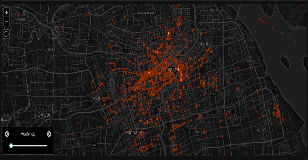
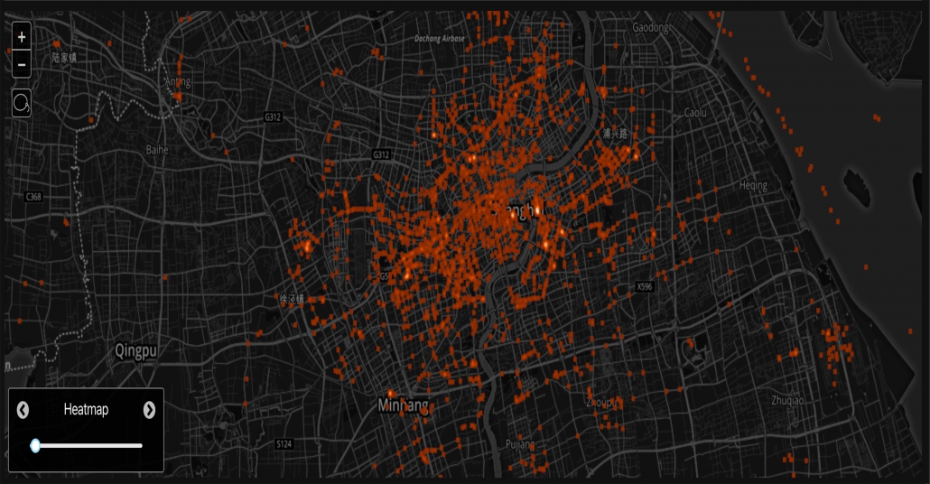
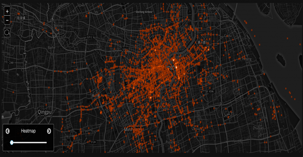
The below images, built on the Tectonix platform and powered by data from X-Mode’s SDK, tell a story about infection and recovery in China. In particular, we pulled locations shared by users in the most densely populated part of Shanghai.
Given the raw data, Tectonix was then tasked with figuring out how to measure social distancing, i.e. whether citizens were isolating themselves or moving amongst each other normally. After some trial and error, they found that the best way to measure this was to filter the data down to devices traveling between 3 and 10 miles per hour. The resulting heat map shows people who are walking, as well as slow-moving vehicles like bikes and scooters.
Note: To reflect changes in movement, each map has been assigned a value on a Movement Index, with 100 being the highest amount of movement recorded. Hover over each map to see this score.
The images above show some of these heat maps over a four week period. Comparing the heat maps shows a clear upward trend. Simply put, at the end of four weeks there were more devices moving at the low speeds which indicate a drop in social isolation.
While the X-Mode platform is not as dense in China as it is in other countries, the results still resonate: within the same time period that China has reported a drop in infections, more people have been reengaging in social movement. Since these results confirm reports in a part of the world experiencing a minor recovery from COVID-19, they are somewhat heartening.
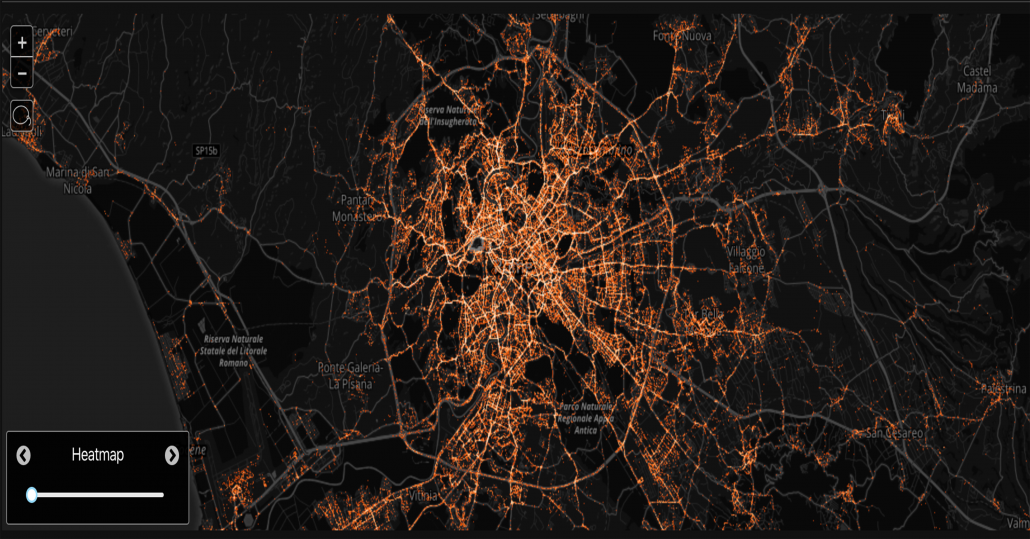
We decided to also look at the data from another country on our platform, one that has been having a different experience with COVID-19 in the last month. This country is Italy, and the images below show location data pulled from the capital city, Rome.
COVID-19 was first detected in Italy on February 21st, and by March 8th all 60 million residents of the country were placed on lockdown. Despite this and other security measures, the virus’ toll has been devasating, particularly in the country’s north; Italy has seen over 3,400 deaths, more than any other country in the world. On March 19th, 475 patients died in the highest single-day death toll from any country.
Similar to the images we created of the outbreak in China, the heat maps above were constructed using data pulled from devices in Rome moving at low speeds. As can be clearly seen, the trend is the reverse of what we see in Shanghai. Between February 15th and March 18th, the amount of people moving in “normal” social patterns went down by over 80%. The drop is particularly drastic after a mandatory lockdown of numerous cities at the beginning of March, showing that people appear to be following government guidelines.
These next images bring us a little closer to home. While the United States has not been hit nearly as hard as China or Italy, it is still in the grips of the virus, and infections and deaths are rising daily. Washington has seen higher numbers than any states, with over 90 reported deaths so far. Like in many states in the US, Seattle officials have not ordered a total lockdown of the state or any cities. This differs from the response in more heavily infected places like Northern Italy and China. Let’s take a look at some data pulled from Seattle.
The heatmaps X-Mode and Tectonix created from Seattle data, therefore, tell a different story from the corresponding maps from Shanghai and Rome. As infections have increased in Washington, movement has gone down. As the data show, though, the drop has not been nearly as drastic. Although it is difficult to compare the situation in such different places, it is interesting to see the difference in human movement patterns in a city with a mandatory lockdown (Rome) versus one without (Seattle.)
It is unclear what the future will hold for the people of Shanghai, Rome, and Seattle. The COVID-19 outbreak has been highly unpredictable so far, and in many ways it has only just begun. The only certainty right now is that there will be a lot of difficult times ahead. Through the darkest of times, though, knowledge is the brightest torch we can carry. X-Mode and Tectonix will continue to provide what insights we can from our real-world data and analytics. We hope others will do what they can to shine a light on the truth and keep the world safe.
Tectonix is a geospatial data visualization platform built specifically to handle massive data sets in near real-time. With processing power unlike any engine of its kind, Tectonix can visualize billions of data points simultaneously, allowing you to spot patterns and trends at the global, national, state and local levels in a single explorative session.
Check out X-Mode’s blog in the coming weeks for more updates on the intersection between location data and COVID-19. For more information on how location data insights can work for you, head over to our data licensing portal today.


