Announcing Atlas: X-Mode’s New Publisher-Facing Dashboard
A conversation with our design and engineering team about our latest client offering.
By Joseph Green
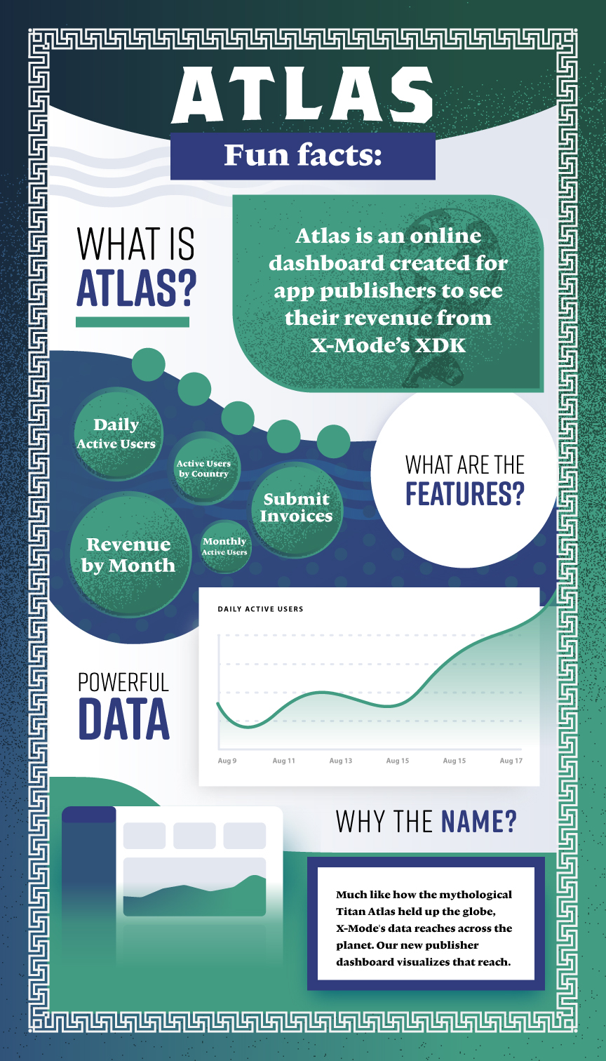
X-Mode is constantly working to provide a better experience for our clients, as well as more streamlined processes for our own employees. Our latest innovation is the development of our publisher-facing dashboard: Atlas. I sat down with the Atlas team — composed of Designer Jonathan Rouse, Information Architect Owen Pycha, and Frontend Engineer Billy Murphy — to talk to them about the project’s conception, the design process, and the advantages it provides to the company and our clients.
Joseph Green (Content Manager): Hello to everyone, and thanks so much for joining me today! I know that all three of you worked really hard to bring Atlas from ideation to a tangible product; can you just describe to me what that product looks like?
OP: Atlas was designed basically like a consumer product. It is a publisher-facing dashboard (app publishers, that is). It is primarily for external use, as it shows publishers their DAUs and MAUs (daily and monthly active users) and how much they’re getting paid for that data. Internally, it is also useful in terms of invoicing. It saves our client success team about 40 hours a month, which is a huge benefit for a small startup like X-Mode where time is at such a premium.
BM: To build off what Owen said, the Atlas dashboard allows publishers to visualize the data that they’re bringing in. It shows them the accuracy of the data points, how many users they have, and most importantly the revenue they’re bringing in. (i.e., the amount of money we’re paying them.) Our main priority was to give our publisher clients something straightforward to look at, so they don’t feel separated from the data monetization process.
JG: Jonathan, I’d like you to walk me real quick through how you approached this project from a design standpoint.
JR: It was a struggle at the beginning for sure, as I had to learn to work with some new tools I’d never used before. I had never used a component library, for example. I picked up on it quickly though, and learned what the scope of the project was versus what I myself was able to do as a designer. I certainly learned a lot. One of the biggest things I learned was how to collaborate and incorporate other people’s work into my own. I also learned a lot about finding compromises, with myself and with the team. That was a big lesson in this project, on the design and the development side.
JG: What are the aspects of this project you all are the proudest of, from a design and a development standpoint?
OP: I liked the way our design team was able to work so well with engineering. Billy was able to take our conceptualization of what the dashboard should look like and turn it into a reality. We had all these mockups, which were kind of fragmented, and the end product is very cohesive. I love how that came together.
BM: I’m really proud of how we’ve remained on target to release this dashboard on time. We’ve had a lot of last-minute projects and setbacks in engineering, and I’m glad we’re going to be able to put out this product that is going to be so helpful for both our clients and our employees.
JR: I echo that. We were able to knock this project out of the park in a really timely manner, especially considering all of the learning curves that design had to go through.
Thank you Owen, Billy, and Jonathan! I learned a lot about what goes into making a publisher dashboard during our conversation. It also demonstrated the value of cross-departmental collaboration. To learn more about the advantages of data monetization with X-Mode, check out our publisher portal today! For any more questions about our outstanding location data, head over to our contact form.


